One Screen, Zero Excuses: A Week With My Whole To-Do List Staring Back at Me
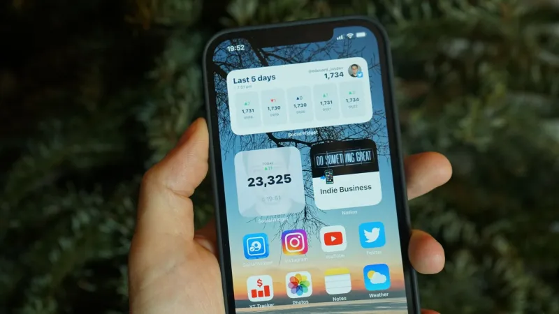
I am a chronic app switcher. My home screen used to look like an airport departures board: Slack, email, Things, calendar, a grocery list, three different note apps, and a timer I opened maybe twice a month. So I ran a very specific experiment: for seven days, I would move my entire mobile to-do system onto one home screen. One page. Widgets only for tasks, calendar, capture, and time. No folders. No app library unless something was on fire. The goal was not minimalism as a personality. It was to see whether cutting app switching actually helps a busy, mobile-first worker get through a normal US week of commutes, Slack pings, school pickup, and last-minute errands.
The rules of the single-screen week
- One home screen page, plus the dock. No second page.
- Four widget zones: today’s tasks, calendar, quick capture, and a timer/timeline.
- Notifications only from the task app and calendar. Everything else had to wait.
- No social apps on the home screen. No email widget. No Slack widget.
- On Android, I used a minimalist launcher. On iPhone, I leaned on widgets and App Library search.
- Every time I wanted to open an app, I had to ask: is this a task, a calendar event, or a capture? If not, it did not belong on the screen.
I tested on a current iPhone and a Pixel running the latest Android. The iPhone setup was the main event; the Pixel was the stress test for launchers. I used Things 3 for tasks, Drafts for capture, Fantastical for calendar, Structured for my day timeline, Widgetsmith for a custom clock-and-weather widget, and Niagara Launcher on Android. That is more tools than the final list, which is part of the story.
Daily testing notes
Day 1 — Setup took 90 minutes, which is a bad sign. I built a clean home screen with a Things 3 “Today” widget, a Fantastical calendar widget, a Drafts quick-capture widget, and a Structured timeline widget. It looked great. Then I tried to check off a task directly from the Things widget and remembered the annoying truth about a lot of widgets: they are billboards, not control panels. Some taps open the app. Some actions work. It depends on the app and the platform. My first real friction wasn’t motivation. It was tap targets.
Day 2 — Capture got faster, but duplicates crept in. Drafts earned its keep immediately: tap, talk, done. I captured “call dentist,” “return the Amazon box,” and “ask about the HOA fence thing” in under a minute total. The problem was that I also still had Apple Reminders and Google Tasks connected to old habits. By lunch I had the same errand in two places. The single screen did not fix my messy capture system; it exposed it.
Day 3 — The calendar widget lied by omission. My Fantastical widget showed the next meeting, but not travel time, prep notes, or the fact that two events were back-to-back on opposite sides of town. I missed the buffer I usually get from opening the full calendar. A widget can show you what’s next. It cannot always show you what’s about to go wrong.
Day 4 — Errands were the real test. At the grocery store, I tried to check items off a Things list from the widget. It worked, but slowly. I ended up using Drafts voice capture for the added items and cleaning them up later. That was fine. The bigger issue was that my grocery list and my work tasks were in the same “Today” view. Seeing “buy oat milk” next to “send Q4 deck” was not the focus hack I imagined. It was context collapse.
Day 5 — Workday: less switching, more searching. Without Slack and email on the home screen, I did fewer reflexive checks. That was a genuine win. But when something urgent came in, I had to use App Library search or the app drawer, which added a weird little pause. Sometimes that pause was good. Once, it was annoying. I also noticed that my task widget refreshed slowly after I added items on my laptop. Widget lag is real, and it makes a “single source of truth” feel like a suggestion.
Day 6 — Weekend reality. Youth soccer, a birthday party, and a Costco run. The single screen handled the calendar fine. The task list got messy because weekend tasks are less linear than work tasks. I wanted a separate “errands” view, but that meant another widget or a folder, which broke the rules. I cheated and added a second page. The experiment survived, but my ego did not.
Day 7 — Prune day. I removed the custom Widgetsmith clock because it was pretty and useless. I kept the task, calendar, capture, and timeline widgets. I also turned off almost every notification except calendar alerts and a single task digest. That was the biggest behavioral change of the week, and it had almost nothing to do with the home screen layout.
What broke under real-world use
- Widget refresh delays. A to-do widget that updates every 15 minutes is not a real-time control panel.
- Tap targets. Checking off a task from a widget is often slower than opening the app. Fine for one item, bad for a grocery list.
- Context collapse. Work and personal tasks need separate views, even if they share one screen.
- Launcher muscle memory. On Android, Niagara Launcher made the home screen cleaner, but I kept swiping to where my old apps used to be.
- The search tax. Hiding apps reduces reflexive opening, but it adds a small search cost every time you actually need one.
- Notification discipline. The screen did not fix notifications. I had to fix notifications.
The five apps that earned a permanent spot
- Things 3. The Today widget is still the best “what’s next” glance on iOS, even with its limitations. The app is a one-time purchase, and the quick-add flow is fast enough that I actually use it.
- Drafts. This is the capture app I keep coming back to. It opens to a blank note, supports voice, and gets out of the way. The free version is enough for quick capture; the Pro subscription is worth it if you want actions and sync.
- Structured. The timeline widget is the closest thing to a visual day plan that does not require me to open a full calendar. It is especially good for blocking a workday around meetings.
- Fantastical. The calendar widget is clean and readable, and natural-language entry is still a joy. It is a subscription, so it only makes sense if you live in your calendar.
- Niagara Launcher. On Android, this was the launcher that made a one-screen setup feel intentional instead of cramped. It is free with a premium tier, and it is the only launcher I did not uninstall by day three.
Widgetsmith did not make the cut. It is a lovely toy, but my custom widget was decoration, not function.
The verdict
The single-screen experiment did not turn me into a monk. It did prove that fewer visible apps can reduce reflexive switching, especially during work hours. But the real gains came from notification limits, a fast capture app, and accepting that widgets are for glancing, not for running your life. If you try this, start with one screen, one task widget, one calendar widget, and one capture button. Then prune hard. The goal is not a beautiful home screen. The goal is fewer moments where you open your phone to do one thing and come out twenty minutes later having bought a lamp.